Looking for the quick and simple explanation on Pivot Tables for Dummies? Allow me to explain.
What is a pivot table?
A pivot table is a data summarization tool. That is, it allows you to take a large set of data and very quickly see many different metrics about it.
Pivot tables offer a wide range of features, allowing you to sort and reorganize your data in many different ways, group different data fields together, view summary statistics such as totals, counts, averages, maximums, minimums, and more.
Most important, there is no need for any complicated functions, macros, or VBA. Pivot tables come right “out of the box” with Excel, and is very easy to use with a nice Drag and Drop interface.
- How do I count the number of sales in each month? Use a pivot table.
- How can I see the sales per month, grouped by each sales rep? Use a pivot table.
- How can I “group by” and sum a column in Excel? Use a pivot table.
How does a pivot table work?
It’s easier to show how pivot tables work with an example.
Let’s assume we have a list of transactions that records the following information:
- Order Date – the date the transaction occurred
- Sales Rep – the sales representative who made the sale
- Category – the broad category of the item sold
- Sub-category – the specific category of the item sold
- Sales – the total sales amount for the transaction
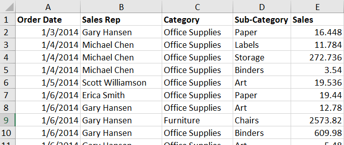
Notice how this is “structured data” or “tabular data.” That is, there is only one row at the top (Index 1) which defines the Column Header or Field Name for each column. Now all the other rows underneath are a separate transactions, or Records.
(Note: having structured / tabular data is very important for creating pivot tables)
Now, you have all this data. What do we want to know from this data? What type of information can we extract? Let’s start simple by getting the Sales Reps’ figures.
Which Sales Rep did the most in sales?
Because we have tabular data, each sales rep appears on more than one row. So how can we calculate the total sales for each sales rep?
One way of doing this (the long way) would be to filter by the Sales Rep column. Then, we could cycle through each Sales Rep, and use a =SUM() formula to find each total.
Another way to do this would be to create a separate table which calculates the totals using some more formulas or macros. Both of these solutions, although feasible, isn’t the best way to go about this. Both options take longer than just creating a simple pivot table.
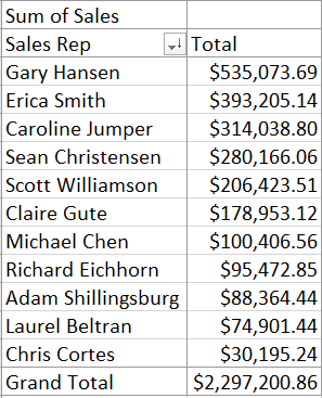
Just a few seconds and couple clicks later, we already generated a list showing each sales representative and their total sales.
(I explain how to make this pivot table later, and also in the companion YouTube tutorial.)
So that’s all fine and dandy, but perhaps you were expecting more? I mean, it’s nice to quickly calculate each reps totals, but it really wouldn’t have taken that long to find out which Sales Rep made the most sales with a few formulas. But what if we needed to find out more?
Which Sales Rep did the most sales per Quarter?
Now our problem just got a lot harder. We don’t just need the total, we need each Sales Reps total for each quarter.
What’s worse, if you remember from our example source data, we’re only tracking the order date. So we also need to calculate specific quarters, then organize our data into those separate quarters, then sort to see which Sales Reps did best per quarter. Or, we can use a pivot table!
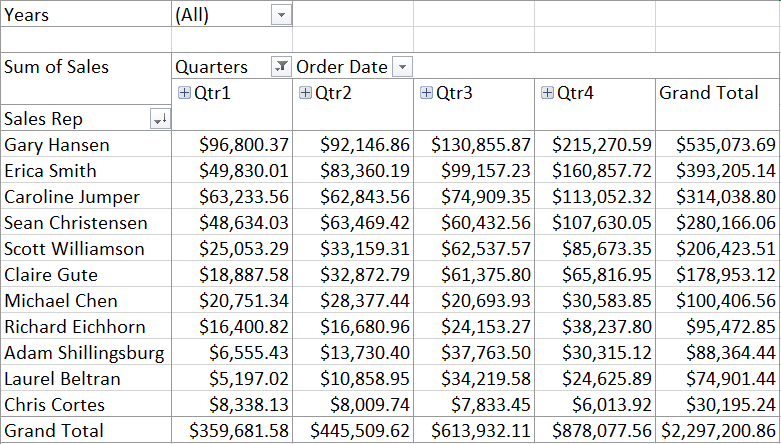
Again, in just a few simple clicks, and we have a wealth of information available to us. Now we see each Sales Rep’s total Sales broken down by Quarter.
Notice at the top is shows “Years.” This is a filter we added, and right now it’s set to All, to show all the years available in our source data. However, we could filter by only 2019 data, or only 2018 data. Or we could show both 2018 and 2019, or filter on any other combination. This is the power of Pivot Tables.
We could have made this exact table without the use of a Pivot Table. But creating all the filters and formulas and organizing and structuring our data in this format would’ve taken a considerable amount of time.
Using a pivot table, this only took about 10, maybe 15 seconds! From here, we could generate some very useful Data Visualization Charts using the information compiled from the Pivot Table.
How do I create a pivot table?
In the next lesson (coming soon) we’ll dive into how we can actually create a pivot table.
Want to be notified when it’s available? Join our mailing list!
[sibwp_form id=2]